Publications
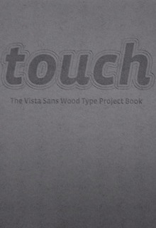
As a fine art printmaker, my approach to this collaborative project employed traditional printmaking strategies to inform and enhance the visual appearance of the edition. During the experimental stages, my objective was to deconstruct the wood type CNC-mediated syntax. This was achieved by printing the type blocks onto acid-free, fine crumpled tissue paper with a relief press. Consequently, the type imprint on the tissue was “liberated” from the woodblock, lockup and fixed location, and could then be altered and repositioned at will: in effect, the type imprint had become a sudarium image.
I inked the type blocks with warm gray lithographic ink and printed them as previously described. Next, the printed tissue paper substrate was stretched out at certain points, which fractured the printed type forms. I then offset- printed these forms onto the edition printing paper by means of an intaglio press. The technique of continuous alteration – both additive and subtractive, developed during this period – helped refine the process employed in the production of the final edition.
The final approach to the printing procedure, although more conventional, proved to be a better creative strategy for manipulating the variability of visual element placement. I tore the edition paper down and monoprinted it with a layer of gray lithographic ink; then I selected type forms that were inked with white and metallic lilac lithographic ink and monoprinted onto the paper. The placement of type was based on a mix of tacit and aesthetic judgement. I then covered the printed type with a second layer of gray, thereby offering a diversity of type forms to enrich the final visual presentation. This printing method replicates the creative strategy that printmaking artists utilize in building up layers to expand the colour event and location on the print.
In the final stage, I relief-printed “touch” in various configurations on the paper, combined with a traditional printmaking technique known as chine-collé, which translates from the French chine, meaning tissue (traditionally from China), and collé, meaning glue. The procedure involves placing glued tissue paper over a selected, inked type block; the glued side of the tissue facing upward. During relief printing, under the pressure of the press, the impression of the inked block is transferred to the tissue and the glued side of the tissue becomes bonded to the paper substrate. Employing the chine-collé technique and incorporating monoprinted type in the sediment, along with other manipulations, enabled the introduction of a unique visual signature of colour location and texture into each instance of the varible edition. This creative approach to printing transformed a mechanically replicative process into one capable of producing infinitely varying versions of a thematic visual design.
I have also created three YouTube videos using the touch edition in iconic landmark sites of the city: outside the Titanic building, in front of the Harland and Wolff shipbuilding cranes, and on the peace line in Belfast. All touching the city.
© Josephine McCormick
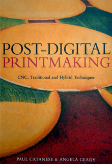
Throughout its history, printmaking has been open not only to the remediation of technologies in the service of the creative idea, but has also, from within its own practice, inspired new forms of technology – Josephine McCormick
The printmaker Josephine McCormick mentions Zygmunt Bauman’s ideas of ‘liquid modernity’ as a particular strand of influence in her art. Bauman’s notion proposed that incremental and irresistible transitions of modernity, taking place over the past two centuries, are a transformation leading ultimately to a melding of all modernistic social and cultural structures and technologies. He considers this process as now becoming a rapidly accelerating deconstruction towards a molten fusion or liquification in human constructs and experience. This possibility seems implicit in McCormick’s printmaking practice, which connects and melds CNC engineering, fluid mechanics and the early modern innovation of viscosity printing in a remarkable hybrid fusion.
McCormick combines CNC plate cutting with her own adaptation of S.W. Hayter’s multiple-colour intaglio viscosity printing technique, which she first encountered during her time at Atelier Contrepoint in Paris. More recently, in her research collaboration with the Northern Ireland Technology Centre at Queen’s University, Belfast, she began a dialogue with the engineers there that has facilitated her aim to achieving a very accurate, depth-specific plate manufacture using CNC milling.
The highly precise control of depth of cut that CNC makes possible has allowed McCormick to explore more complex simultaneous colour possibilities with viscosity printing than would be achievable using the traditional etching or gravure methods that were the basis of Hayter’s original technique.
In simultaneous colour viscosity printing, all intended colours are applied together to the plate before printing. This conveniently resolves the problem of a multiple registration process for multiple-colour printing. The technique relies on the modulation of three factors: the levels of depth in the incised plate, the varying quantities of oil in adjacent colours of ink and finally, the hardness or softness of the roller used in the sequential application of inks to the plate. The critical innovation of viscosity printing specifically lies in its exploitation of the tendency of liquids of different flow properties – i.e. thick versus thin – to repel each other when applied in proximity.
McCormick uses rollers of 50 shore (hard) and 25 shore (soft). In this way, her modulation of the parameters of the plate cutting and ink viscosity can yield predictable results.
In the sequence of inking, the intaglio tone or colour is applied first and wiped in the usual way. The second colour of ink, with a thin consistency ‘like melted chocolate’, is rolled on to the uppermost plate level. A hard, or high-shore roller is used at this stage and care is taken to avoid downward pressure that might force the ink into lower levels of the plate’s relief. The intaglio ink is left undisturbed by this and subsequent ink applications. A third colour of ink, of a more viscous consistency than the preceding one, is then applied with a softer roller. Now, downward pressure is exerted such that the ink coats a deeper level of the plate. Provided that the difference in flow between the two inks of differing viscosity is correct, they will not intermix. Using multiple depth levels on the plate, this process can be extended, as McCormick has investigated in her work, to accommodate the further interposing of viscosity colours.
As Hayter described it, the viscosity effect depends not so much on the relative ‘stickiness’ of the inks but on the difference in the speed of flow between them. A tacit bench-top test, to establish if the correct ink viscosity relationship has been reached, is to roll out a little of the runny ink, then simply impress a thumb coated with the thicker ink into this: a distinct thumbprint signals viable repellence. McCormick’s quest for more precise control over the results in printing led her to undertake a rheological study of ink prepared to various viscosity levels. In collaboration with the Particle Analysis Laboratory at Queen’s University, Belfast, using rheometric methods to measure the flow of the inks, she was able to establish the precise oil quantities that reliably yield a critical point of repulsion between two inks. This information has allowed her to more precisely calibrate the flow properties of the ink – facilitating predictable colour distribution on her plates. Fine modulation of these parameters has also enabled McCormick to bend the rules of viscosity by creating controlled colour blending in selected areas of the plate. The rich, complex – even spontaneous – feel of the colour interplay of McCormick’s prints somewhat belies the premeditated and careful modulations of cut depth and ink flow precision that she orchestrates to create them. Her approach particularly exploits the quantifiable gradation of depth that can be controlled in CNC cutting. In each plate, she explores the opportunity to apply colour across a gradient of depths in many possible combinations. This variability will appear across several interpretations of a particular plate, often sharply contrasting with the more constant intaglio component.
Areas of colour established by the depth and width of the CNC cut and image quality are also affected by the nature of CNC tool-marking itself. In this way, McCormick uses CNC precision to predetermine, with a high degree of control, colour distribution and definition in her prints. She experimented with a range of plate materials including copper, aluminum, steel, brass, zinc and even linoleum – seeking a material that works well, both for the physical constraints of CNC machining and in relation to the forms of her plate designs. Her plates have been cut principally on the Bridgeport VMV 1000/22 three-axis digital CNC mill, accommodating plates up to 100 x 60cm plate in dimension. In practice, the clamping needed to keep the plate secure during milling reduces the actual size of plate that can be cut – the size of the press bed is, of course, a further constraint on scale.
The gauge of the plate is also determined by the limiting factors of both CNC machining and the press. McCormick typically uses a 3mm gauge and has ultimately settled on brass and aluminum as her preferred plate materials. The CNC precession-cut pattern induces characteristic concentric rings and lines of indentation or “ribbing” in the plate as it mills the design. While she has reduced the definition of this distinctive marking by using finer routing tools, McCormick accepts this as a tangible feature of the hybrid process she has developed. This sits alongside the inevitable material influence of the surface character of the plate that arises across all traditions of printmaking technique.
As with many printmakers, drawing is an important precursor to McCormick’s plate-making. Her ideas stem from a variety of sources, including sonic waveform data. Geometric repeat formations have been a particular feature of her recent prints and she has found that the CAD drawing to CNC output workflow, required to prepare CNC-ready data, has affinity with her aesthetic objectives. McCormick works with the constraints of CNC machining in the vector designs she uses. Particular issues are the limits to changes in direction that the CNC tool can accommodate, and the avoidance of self-intersection in the cutting routine. While this can create some restrictions in the geometries that can be cut, this issue is usually resolved in the FeatureCAM software she uses to prepare the CNC data. At this stage, cut depthand cutting routines are assigned, and the opportunity can be taken to inspect the plate design virtually, from any angle, and preview the cutting routine before finally committing to a CNC pass.
In 2005 an international artist in residency program was initiated by RMIT to contribute to contemporary art discourses within the local cultural community of Melbourne and develop active links with global networks. Partnerships with local and international cultural organisations assist many of the residences. The selected artists are invited to work on-campus for a period of four to six weeks and present their research in the form of an exhibition, lectures, presentations and seminars. Since 2005 the School of Art has hosted twenty-two international artists through the program and in 2006 each donated a work to the art collection to commemorate their residencies.
Josephine McCormick, from Northern Ireland, was an international artist in residence in 2006. Trace exemplifies her innovative approaches to photo-etchings of mobile phones inked with phosphorous pigments and displayed using UV lights in a darkened gallery space. Defining herself as a technological archaeologist excavating the present, the idea of unseen communicative interfaces and knowledge storage provides the conceptual frameworks for her art. The inclusion of spatial sound constructed by RMIT sound artist, Philip Samartzis ensured an immersive environment of the work.
‘Within my work I wish to create images of contradiction, to provide a compositional drama in which nothing is found in the order in which it was first laid down. Disparate elements emerge and bond together at certain points – to disguise, or to identify – creating a surface tension within the work.
Everything is implicated in, or bears the trace of something else. This visual stratification of images echoes the printmaking process itself, where even the omission of something, a fragment of the image maybe, becomes as positive an act of inclusion.
I am also interested in embracing new technologies within printmaking. This has led to collaborations with genetic scientists and, recently, to utilising CAD/CAM in the making of printwork’ Josephine McCormick studied Fine Art and printmaking at Liverpool John Moores University, Camberwell College of Art and the University of Ulster. Her interest in printmaking is combined with her interest in digital technologies, a synthesis reflected in her work. She has received awards from the Arts Council of Northern Ireland, the British Council and the Printmakers’ Council amongst others.
Her work feaures in many public and corporate collections worldwide, such as the Australian Print Workshop, the Academy of Art, San Francisco, Mitsubishi Trade Union Centre, Japan and the Ulster Museum.
When was the last time you heard a sculptor or painter saying that they were going into the studio to do a bit of 'sculpture-making' or 'painting-making'? The 'making' of prints underlines the close relationship between the technical and the creative act of printmaking. Indeed, one of its many attractions as a discipline is the wide range of techniques it offers to artists.
Throughout its history, printmaking from within its own practice, inspired new forms of technology. Photography, for example, drew on experiments with lithography. Where would we be without CYMK, four colour reproduction as developed from the 18th century mezzotint techniques of Le Blon and 19th century colour woodblock printing? Printmaking has a fascinating genealogy of remediation, full of historical affiliations and resonances.
I identified that a Computer Numerically Controlled (CNC) machine would offer possibilities in the making of a printing plate. The base concept of CNC process modeling is that a computer program controls a cutting tool head. It is a computer - programmed digital routing tool.
I collaborated with The Northern Ireland Technology Centre (NITC), which is part of Queen's University of Belfast, N. Ireland. The two CNC machines at NITC are a VMC100, 22 Digital and a VCM 600, 22 and both offer a smooth technological flow between the design and machined plate. The design and management team at NITC are Tom Edgar, Director, Robert Seaman, Manager and James Knox, Head of the Engineering Department. It was interesting and refreshing to collaborate with engineers - 'Why do you want a squiggle line? as an artist I had to justify my work. At first we spoke in two different languages, but gradually we developed a common language and terminology.
The cutting pattern of the CNC machine left a defined 'ribbing' or circular indentations on the surface of the plate though, with the introduction of a smaller routing head, this was kept to a minimum. I actually liked the effect and accepted the pattern as part of the plate. The main limitation of creating a CNC - machined plate is that a design has to take account of the constraints on the routing tool in changing direction on the plate; this had an influence on the overall design. However, the Queen's university CNC machine also had digital software called FeatureCam, which constructs a virtual design on the computer. Depths can be ascribed and the software is sophisticated enough to allow the design to be viewed from a variety of angles, before the final decision to route the metal is made. The illustrations here of the CNC - machined plate inked in colour, using the principles of Hayter's viscosity printmaking technique, give an indication of how colour distribution works across the CNC plate and of the path of the cutting tool.
Hayter documented the principles of viscosity printmaking in a highly scientific manner, and in my research, I was able to take advantage of his methodology to contrast and define the CNC practice framework. Viscosity printing is a unique method, based on tacit knowledge accumulated over many years of the inter- relationship between the etched plate, roller and colour interface. The CNC machined plates cannot replicate the arbitrary gestural marks of an etched plate. However what the CNC intervention does facilitate is:
- The predetermination of colour areas through depth/nature of the CNC cut.
- The opportunity to specify depth and width of line at the design stage.
- The precision and control of the design routed on the plate.
- The replication of that plate to another CNC facility anywhere in the world.
- A CNC - machined plate facilitates the organization of colour distribution using selected principles of intaglio simultaneous colour printmaking.
Stanley William Hayter, founder of the renowned Atelier17 workshop in Paris, France, invented viscosity printmaking in the 1940s. It followed his experiments with the application of surface colour to an intaglio printing plate in 1930 and, in collaboration with Anthony Gross, the further exploration of this method of 'simultaneous printing' from surface and intaglio inking in 1932. In 1940, after the German occupation of Paris, Hayter moved the workshop to New York, where he continued to investigate simultaneous multi-coloured printing.
The main principles of intaglio simultaneous colour printmaking are outlined in Hayter's book, New Ways of Gravure' (published in 1966).
'Thus perhaps a hard roller will carry a film of colour of low viscosity which will deposit only on the original unetched surface of the plate: a soft roller, carrying a colour of higher viscosity, will then surround these forms with a second colour, neither affecting the intaglio colour originally present in the plate which might appear between the two.'
The key point is that inks of different viscosity values (rate of flow) repel each other. 'High viscosity' indicates that the pigment is mixed with less linseed oil in relation to the other colours being used; 'Low viscosity' that the pigment has a high percentage of oil again in comparison to the other colours being used. Based on this principle, a multi-coloured inked plate may be printed through the press.
Other elements and principles that define this printing process are briefly:
- The control of surface tension (of the film of colour)
- The order of succession of colours
- Use of hard and soft rollers and pressure
- The direction of rollers with colour over the plate
As part of the research I undertook a rheological study in collaboration with Mr. Damian Chandler at the Particle Analysis laboratory at Queens University. Rheology is the study of the change in form and flow of matter, embracing the measurement of viscosity. The purpose of the study was to determine and measure the point at which two inks of different viscosity values repel each other for the purpose of controlling colour distribution. The calibration of flow behaviour also served as a measure of colour consistency and provided a controlled constant, complimenting the controlled depth of the CNC machined printing plate and the constant of hard and soft printing rollers.
A knowledge of the rheological behaviour of printing inks of different viscosity values enables the formulation and prediction not only of colour separation but also of controlled colour merging over the CNC machined plate.
My preliminary research using CNC technology to control the depth and design of the plate marked the beginning of presenting a 'hybrid' CNC - mediated print. It was evident that the introduction of constants would substantiate and inform the research. These are the constants identified:
- The printing roller 'shore' [a measurement of how hard or soft the rollers are] Those used in the final printing of the plates were 50 and 25 shore
- The size constraint of the VMC 1000,22, Digital CNC machine - which is 1000x600mm. [However, in consultation with the engineer, 500 x 400mm was selected as the plate had to be clamped down during routing. This was also the size of the bed of the press on which the cut plate would be printed]
- The gauge of the metal - 3mm gauge was chosen, as this was suitable both for the printing press and the CNC machine
- Pressure of the printing press
- Use of the same metal - brass
Various metals were cut, including copper, steel, zinc and brass [also - out of sheer curiosity - lino] to identify which was the most appropriate for the CNC process.
Test pieces embracing the constant factors referred to above were made to identify the depths of cut most appropriate for viscosity printing.
My research over the last three years has involved the remediation of Hayter's viscosity printing by the integration of CNC digital technology towards a practice framework for artists wishing to incorporate CNC technology.
The CNC technology has enabled me to predetermine the depth and design of the plate by virtual proofing in FreeCam before the plate has been manufactured.
- Black, P. Moorhead, D.& Kane, J. The Prints of Stanley William Hayter; A Complete Catalogue. 1992, Phaidon Press Ltd., London.
- Bolter, J. & Grusin, R. Remediation - Understanding New Media. 2000, MIT Press.
- Hayter, S.W. New Ways of Gravure. 1966, 2nd Edition, Oxford University Press, London.
- Lin, S.C., Chen, C. & YU-PU,Y. CNC Process Modeling Using SmartCAM. 1995, Scholars International Publishing Corp.
- Ready, K. Intaglio Simultaneous Colour Printmaking - significance of materials and processes. 1988, State University of New York, Albany.
- McCormick, J. “Print-making it real. Josephine McCormick investigates a process combining the latest digital engineering technology with S.W. Hayter’s viscosity printmaking techniques” Printmaking Today, Vol. 10. Issue 4. 30-31.